Vyable
Turning uncertainty into a brand built on evidence.
The challenge
Tools that evaluate ideas tend to be cheerleaders or black boxes. Vyable had to be willing to say “not yet, and here's why” without feeling hostile, and without hiding how it reached the verdict.
The idea
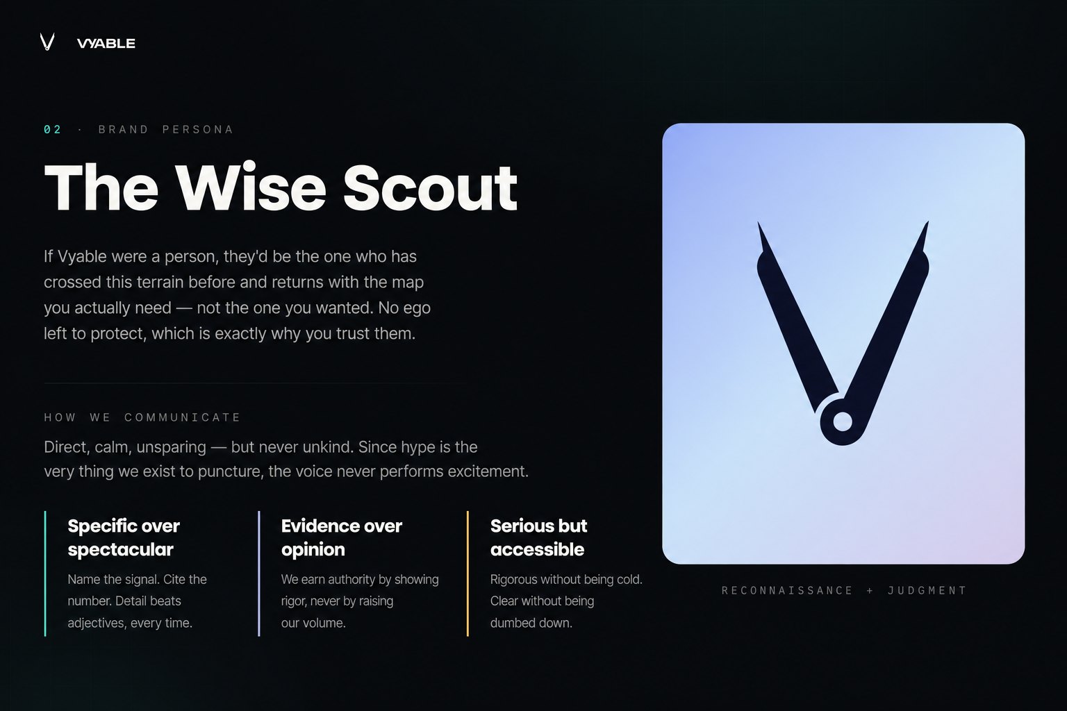
The Wise Scout: experienced, direct, entirely on the customer's side. The customer carries the conviction; Vyable goes ahead, examines the terrain, and returns with the map. Its authority comes from showing its work — evidence, confidence, and a visible path to the conclusion.
The identity
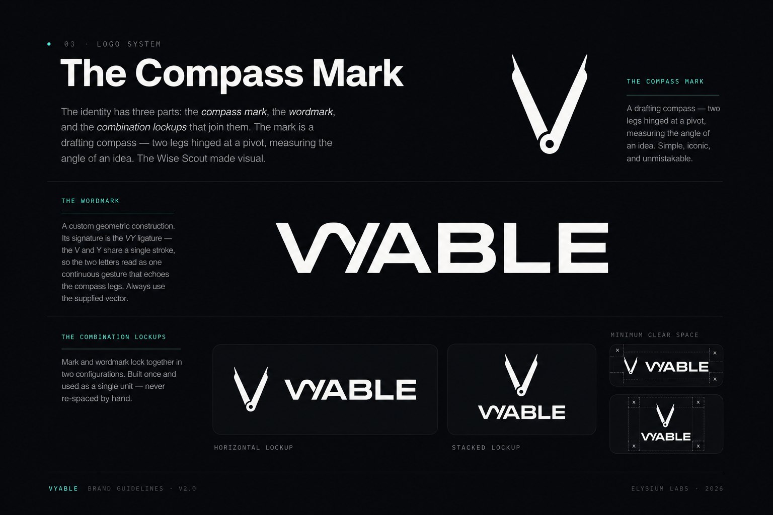
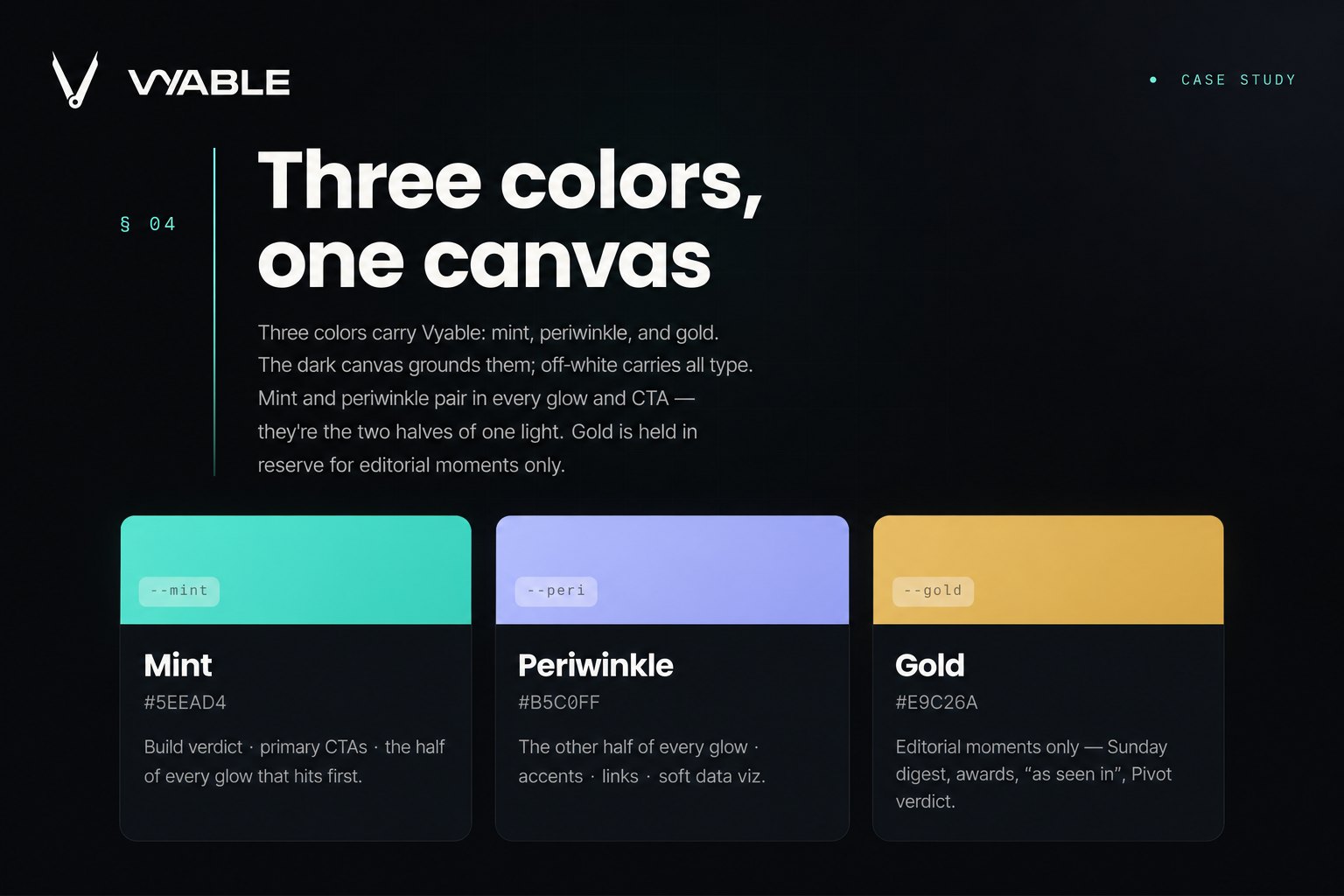
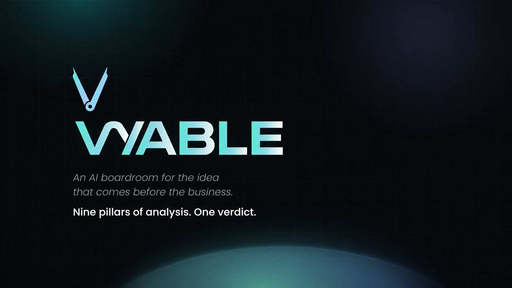
A compass mark — two measured legs on a central pivot — drawn into a custom VY ligature. A near-black canvas holds focus while mint, periwinkle, and a deliberately rare gold carry meaning. Two typefaces split the labor: one for evidence, one for judgment. Promotion to the verdict voice is earned, never automatic.
The outcome
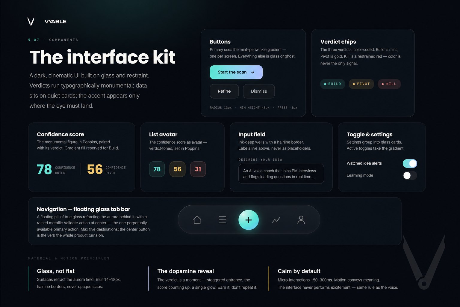
A complete system that extends straight into the product UI: verdicts arriving with typographic weight while evidence sits on quiet, glass-like surfaces. Conviction, meeting consequence.